
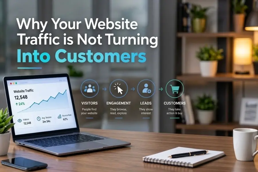
Why Your Website Traffic Isn't Turning Into Customers
1. You Are Attracting the Wrong Traffic
Not all website visitors are potential customers.
You may be receiving traffic from people who are curious, researching a general topic, looking for free information, or searching for a cheaper alternative. They may increase your page views, but they are unlikely to make a purchase.
For example, someone searching for “how to design a logo” may not be ready to hire a branding agency. They may simply be looking for a tutorial.
How to fix it
Review the keywords, advertisements, social media posts, and referral sources sending visitors to your website. Ask:
- Does this traffic match my target customer?
- Does the visitor have a genuine problem that my product or service solves?
- Does the landing page match the promise made in the advertisement or search result?
- Are visitors arriving with buying intent or only informational intent?
Create separate content for different stages of the customer journey. Educational articles can attract attention, while comparison pages, case studies, product pages, and consultation pages can capture visitors who are closer to making a decision.
2. Your Value Proposition Is Unclear
Visitors should understand what you offer within a few seconds of arriving on your website.
If your homepage says things like “We deliver innovative solutions” or “Helping businesses succeed,” visitors may not know what you actually do, who you help, or why they should choose you.
A strong value proposition answers three questions:
- What do you offer?
- Who is it for?
- What result can customers expect?
Weak example
Innovative digital solutions for modern businesses.
Stronger example
We help small businesses generate more qualified leads with affordable, conversion-focused websites.
The second version is more specific. It identifies the audience, the service, and the expected outcome.
How to fix it
Rewrite your headline so it focuses on the customer’s problem and desired result. Support it with a short explanation and a clear call to action.
Your opening section should quickly communicate:
- The problem you solve.
- The people you serve.
- The benefit of working with you.
- The next step visitors should take.
3. Your Website Talks About You Instead of the Customer
Many websites focus too heavily on the company:
- “We have 15 years of experience.”
- “We use advanced technology.”
- “Our team is passionate.”
- “We provide high-quality solutions.”
These details may be useful, but they are not usually the first things customers want to know. Visitors are primarily asking:
- Can you solve my problem?
- Will this work for someone like me?
- How much effort will this require?
- What happens after I contact you?
- Can I trust you?
How to fix it
Change your copy from company-centered to customer-centered.
Instead of writing:
We provide professional accounting services.
Try:
Spend less time managing finances and more time growing your business with reliable monthly accounting support.
Focus on outcomes, not only features. Explain how your product or service saves time, reduces risk, increases revenue, improves convenience, or solves a specific frustration.
4. Your Call to Action Is Weak or Confusing
A visitor may be interested in your offer but still leave because they do not know what to do next.
Common weak calls to action include:
- Submit.
- Learn more.
- Click here.
- Get started.
These phrases are not always wrong, but they often fail to explain the benefit of taking action.
Stronger call-to-action examples
- Get Your Free Website Audit.
- Book a 20-Minute Consultation.
- See How the Process Works.
- Start Your Free Trial.
- Request a Custom Quote.
Your call to action should be visible, specific, and connected to the visitor’s immediate need.
How to fix it
Use one primary action on each important page. Avoid giving visitors too many competing choices, such as “Buy Now,” “Read Our Blog,” “Follow Us,” “Download This,” and “Contact Us” all at the same time.
The more important the page, the more focused its next step should be.
5. Visitors Do Not Trust Your Business Yet
Trust is one of the biggest barriers to conversion, especially when visitors are being asked to spend money, share personal information, or commit to a service.
A professional-looking website is helpful, but visual design alone does not prove credibility.
Visitors may hesitate if your website lacks:
- Customer reviews.
- Testimonials.
- Case studies.
- Client logos.
- Clear contact information.
- A visible returns or refund policy.
- Security information.
- Professional certifications.
- Transparent pricing or process details.
How to fix it
Place trust signals close to the decision point. A testimonial near a consultation form is more persuasive than a testimonial hidden on a separate page.
Use specific proof whenever possible. Instead of:
Our customers love us.
Use:
We reduced our customer acquisition cost by 31% in three months.
Real names, companies, photos, measurable results, and detailed stories generally create stronger credibility than vague praise.
6. Your Offer Does Not Feel Valuable Enough
Visitors may understand what you sell but still decide that it is not worth the price.
This does not always mean your price is too high. It may mean that your website has not clearly communicated the value of the offer.
Customers compare the expected benefit with the perceived cost, risk, time, and effort involved.
How to fix it
Make the value easier to understand by explaining:
- What is included.
- Who the offer is best suited for.
- What problem it solves.
- How long it takes to deliver results.
- What makes it different from alternatives.
- What happens if the customer is not satisfied.
If the product is complex, offer a comparison table, demonstration, sample, free assessment, trial, or detailed explanation of the process.
Do not assume visitors will calculate the value for themselves. Show them.
7. Your Landing Page Does Not Match Visitor Intent
A common mistake is sending all visitors to the homepage.
Someone clicking an advertisement for “emergency air-conditioner repair” should not land on a generic page that says, “Welcome to our company.” They should arrive at a page that immediately confirms they are in the right place.
A high-converting landing page should match:
- The visitor’s search query.
- The advertisement or social post.
- The visitor’s problem.
- The promised offer.
- The desired action.
How to fix it
Create dedicated landing pages for major campaigns, services, customer segments, and search intents.
For example, a marketing agency might create separate pages for:
- SEO services for local businesses.
- Social media management for restaurants.
- Paid advertising for online stores.
- Website design for professional firms.
Specific pages usually create a smoother experience than forcing every visitor through the same generic homepage.
8. Your Website Is Difficult to Use
Even interested visitors will leave if your website is frustrating.
Common usability problems include:
- Complicated navigation.
- Unclear menus.
- Poorly organized information.
- Broken links.
- Difficult-to-read text.
- Intrusive pop-ups.
- Buttons that are hard to find.
- Forms that do not work.
- Important information hidden below the fold.
The goal is not to make visitors explore your website. The goal is to help them find the information they need and take the next step with minimal effort.
How to fix it
Ask someone unfamiliar with your business to complete a few tasks:
- Find a specific product.
- Request a quote.
- Locate your contact details.
- Understand your pricing.
- Find your returns policy.
- Book an appointment.
Watch where they hesitate. Their confusion will often reveal problems that your internal team has stopped noticing.
9. Your Website Is Slow or Broken on Mobile
A slow website can damage both user experience and conversions. Mobile visitors are particularly sensitive to pages that load slowly, jump while loading, or display forms and buttons incorrectly.
A website can look perfect on a desktop computer and still be frustrating on a phone.
How to fix it
Test your website on different devices and connections. Pay close attention to:
- Page loading time.
- Font size.
- Button size.
- Image scaling.
- Menu behavior.
- Form usability.
- Checkout functionality.
- Payment options.
- Pop-ups and banners.
Compress large images, remove unnecessary scripts, reduce excessive animations, and make sure your most important content appears quickly.
10. Your Forms Ask for Too Much Information
Every additional form field creates another opportunity for visitors to abandon the process.
If someone wants a simple quote but your form asks for their full address, company size, budget, phone number, job title, and detailed project description, the form may feel like too much work.
How to fix it
Ask only for the information you genuinely need at that stage.
A first-contact form may require only:
- Name.
- Email address.
- One short message.
You can collect additional information later, after the visitor has shown stronger interest.
Make form errors easy to understand. If a submission fails, clearly explain what needs to be corrected without deleting everything the visitor has already entered.
11. Your Content Does Not Answer Buying Questions
Many businesses publish content that attracts traffic but does not help visitors make a decision.
An article may explain a general topic while leaving important questions unanswered:
- How much does it cost?
- Is this suitable for my situation?
- How long does it take?
- What are the risks?
- What alternatives exist?
- What does the process involve?
- What results can I realistically expect?
How to fix it
Create content for people who are actively evaluating their options. Useful formats include:
- Product comparisons.
- Pricing guides.
- Customer case studies.
- Before-and-after examples.
- Frequently asked questions.
- Implementation guides.
- Reviews and demonstrations.
- “Best for” recommendations.
Educational content earns attention. Decision-making content helps turn attention into business.
12. The Checkout Process Creates Friction
For online stores, a visitor may be ready to buy but abandon the purchase during checkout.
Research from the Baymard Institute identifies unexpected additional costs, slow delivery, lack of trust, forced account creation, and complicated checkout processes among common causes of abandonment. Its research reports that 39% of surveyed shoppers abandoned checkout because extra costs were too high, while 19% abandoned because they were required to create an account.
How to fix it
- Show shipping fees, taxes, and other charges as early as possible.
- Offer guest checkout.
- Reduce the number of form fields.
- Display delivery estimates clearly.
- Provide several trusted payment methods.
- Show return and refund information near the purchase button.
- Make error messages specific and easy to resolve.
- Keep the order summary visible until payment is complete.
Do not make customers work harder at the moment they are ready to give you money.
13. You Are Not Measuring the Right Conversions
A low sales number does not always reveal where the problem is.
Your website may have several conversion points:
- Product purchases.
- Quote requests.
- Contact form submissions.
- Phone calls.
- Appointment bookings.
- Email subscriptions.
- Downloads.
- Live-chat conversations.
If you measure only final sales, you may miss the steps where visitors are getting stuck.
How to fix it
Track the full conversion journey:
- Visitor arrives on the website.
- Visitor views an important page.
- Visitor clicks a call to action.
- Visitor begins a form or checkout.
- Visitor submits the form or completes the purchase.
This helps you identify whether the problem is poor traffic quality, weak messaging, low engagement, form abandonment, or checkout friction.
For example, many visitors clicking “Get a Quote” but few completing the form suggests a form or trust problem—not necessarily a traffic problem.
A Practical Conversion Audit
Use this checklist to review your website:
- Can a first-time visitor understand your offer immediately?
- Is it clear who your product or service is for?
- Does each important page have one obvious next step?
- Does your copy explain benefits rather than only features?
- Are reviews, testimonials, and proof easy to find?
- Can visitors see pricing or understand the cost structure?
- Does your website work smoothly on mobile?
- Are pages, forms, and payment features working correctly?
- Can visitors contact you without searching?
- Do your landing pages match the traffic source?
- Are you tracking each major conversion step?
- Have you tested your most important pages with real users?
Final Thoughts
Website traffic is only the beginning of the customer journey. Visitors become customers when your website gives them a clear reason to trust you, a compelling reason to act, and an easy way to take the next step.
Start by identifying the biggest point of friction. Improve one high-impact page, form, offer, or checkout step at a time. Then measure what changes.
More traffic may increase your numbers temporarily, but a clearer, more credible, and easier-to-use website is what turns attention into revenue.